Plant Performance Overview
For a portfolio administrator, it is always essential to be able to have a high-level view on the main telemetries and plant performances in order to accelerate the overview of the portfolio and understand which plants may be worthy of more in-depth analysis. The Plant Performance section is designed to provide an immediate view of Solar Generation (AC) production at plant level (thus combining the single production of all compatible inverters registered for the plant in question) and also of the recorded performances… with time windows that can be selected in a custom way.
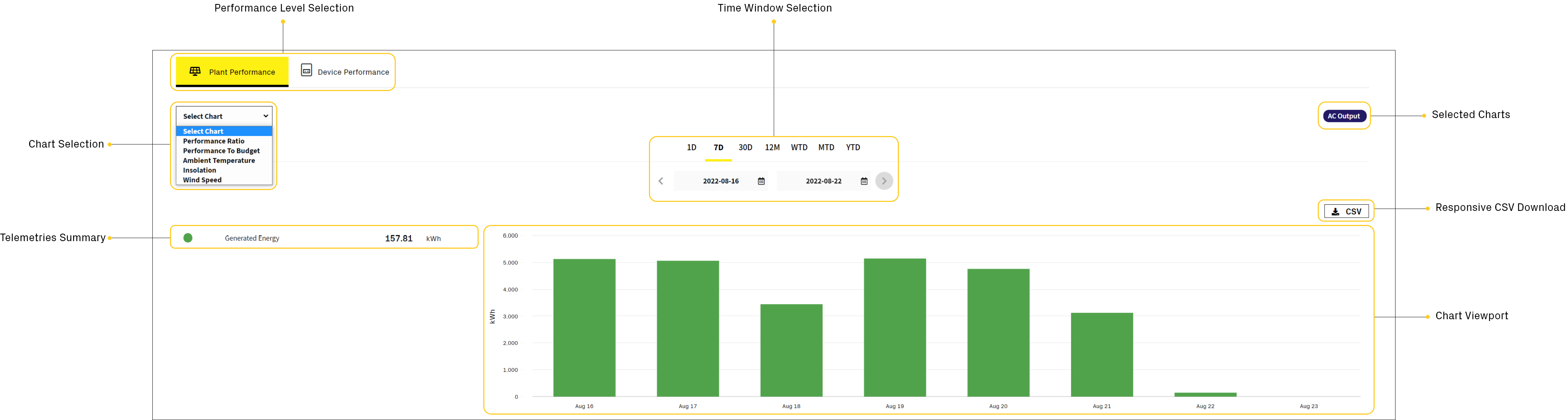
Performance Level Selection
The Performance Level Selection tab, allows you to select the type of detail you want. By default, the tab is positioned on Plant Performance, from which you can obtain an aggregate level of details; however, it is possible to switch on Device Performance at any time in order to obtain a single device level of details.
Chart Selection & Selected Charts
The Chart Selection box allows you to open a drop-down menu in which to select the charts of your interest.
This menu is dynamically populated based on the devices installed and the activated performance configurations: whenever you select a chart type a chip with the corrisponding name will be created and positioned in the Selected Charts area; these chips control the displaying of the charts in the Chart Viewport.
Time Window Selection
The Time Window allows you to choose the time window in which to view the selected charts. Depending on the time window, the chart will change in its data points representation; for example: for the Solar Generation (AC) chart, selecting a window for a day (1D) will allow you to view a line trend with power data points shown every 15 minutes; selecting a window for a week (7D) will allow you to view a bar chart in which energy data points are shown in daily increments.
The time ranges that can be selected are:

Today
Current Day. The day starts at 12:00 AM. Data points are shown in 15 minutes increments.

Seven Days
Previous 7 calendar days including today. Data points are shown in daily increments.

Thirty Days
Previous 30 calendar days including today. Data points are shown in daily increments.
Twelve Months
Previous 365 calendar days including today. Data points are shown in monthly increments.

This Week
Current solar week, starting from sunday. Data points are shown in daily increments.
This Month
Current solar month, starting from the first day of the month. Data points are shown in daily increments.
This Year
Current solar year, starting from the first day of the year. Data points are shown in monthly increments.
Responsive CSV
The Responsive CSV button allows to download, in CSV format, the telemetries of the selected and represented charts.
The file adapts to the selected time window so it will be more or less populated based on the number of data points.
Let’s take the following chart as an example:
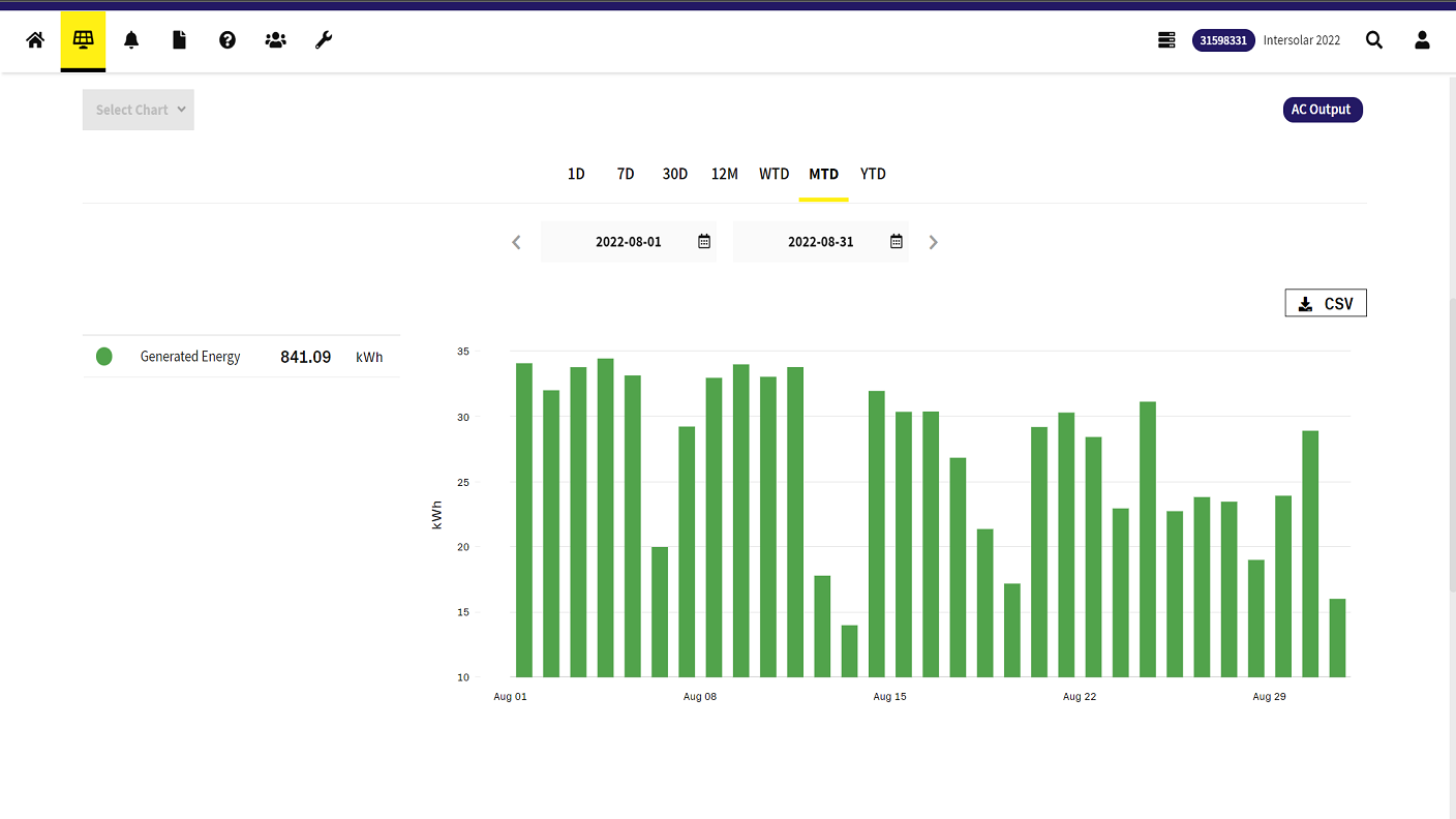
We are viewing the energy produced in August, with data points that are shown in daily increments; try to download the CSV example file down below, you will see that you’ll get exactly the telemetry data of the time window we have observed in the image above:
Telemetries Summary
The Telemetries Summary allows to have a summary of the most important telemetries associated with the selected chart.
The summary changes according to the type of chart, because the physical quantities involved changes; at the Device Performance level, the summary also increases in detail based on the type and number of device selected.
Chart Viewport
The Chart Viewport represents the actual section of the chart that can be consulted and interacted with.
It is possible to move with the cursor inside the viewport in order to interact with the data points represented and, based on the type of chart, a pop-up curtain will be rendered containing the main information referring to the selected data point.
Based on the type of charts selected, you can have a mutually exclusive or stacked rendering.
For example by selecting AC Output, Insolation, Temperature the charts will be stacked one on top of the other:
Instead, by selecting Performance Ratio the AC Output chart will be replaced because the rendering is mutually exclusive.